Critchfield Construction was referred to me by another local business owner, as they were working with an agency and needed a change. We began small with one postcard to test the waters and relationship, and when that actually got results, we continued with more, as a campaign. Then I was asked to take a look at their website. It was already designed basically as you see it, but there were many gaps in the information and the navigation wasn’t easy to follow. The entire website needed to be re-written, and some minor design tweaks made a major difference in its appearance. This is one of those jobs where the foundation was there, and they didn’t need to spend a ton of money to update and fix the overall issues of the site but some minor flaws made for a poor representation.
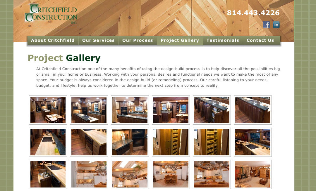
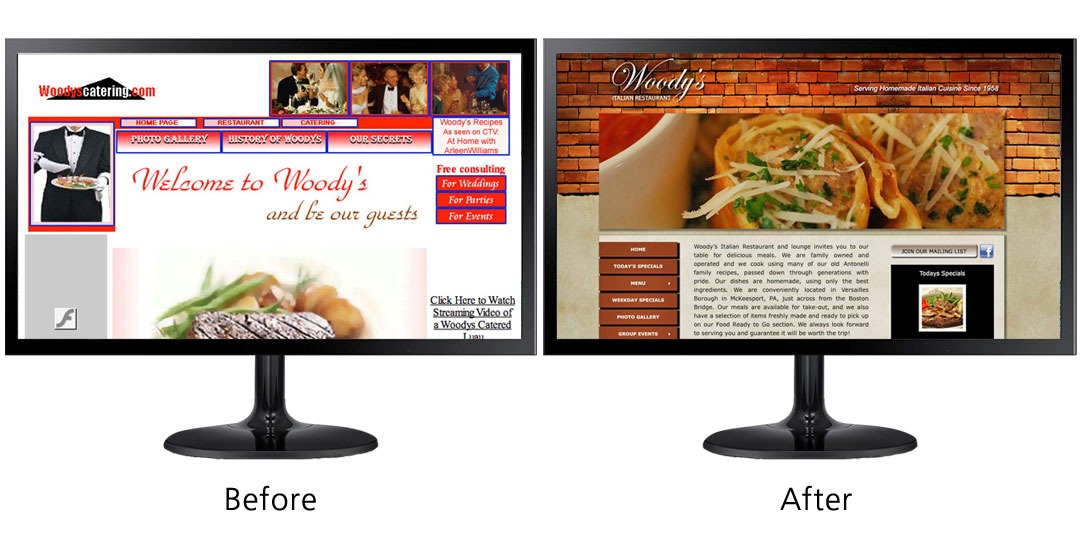
One thing missing completely from the site was a project gallery. In design and construction, that’s the MOST important section to show. I added one, then took it a small step further and also put in a Before and After section. With these changes, the client is once again feeling proud of their site and hopeful that we will continue to implement successful marketing strategies.
We only did one round of changes, there are still improvements to do but this takes us to the next step which will be email blasts, with links to certain subjects on their site. More site updates will come as we see the need for them.


